In Search of a More Unified Brand Identity
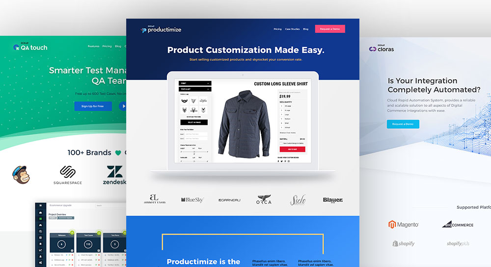
You may know DCKAP as an enterprise-level service provider for e-Commerce customers. But did you also know that we have a suite of products built for the platforms and technologies our customers use on a daily basis? Perhaps you’ve seen our products in passing, but never realized they were built & implemented by DCKAP – which is exactly the reason we’ve undergone an extensive rebranding exercise for our products.
Last year, you probably noticed that DCKAP went through an extensive brand & identity update (we know, everyone loves the rhino!), so this year, we thought it appropriate to give the same love and attention to our product suite. While our products have always been great, we felt they needed a unique identity that also relates to the characteristics of the parent brand. Through rebranding, we’ve created a solid, unified brand presence for our product suite, that now shares commonalities across the DCKAP brand-scape, while still allowing each product to develop a unique identity.
Below we dive into our process and share the thinking behind how we got here.
In addition to our DCKAP client service offerings and platform extensions, we currently have three core products:
QA Touch – a test management platform for quality assurance teams.
Productimize – a custom product configurator for eCommerce customers.
Cloras – a rapid, cloud-based, integration system for Magento & P21 customers.
Shown below are the product logos before and after the rebrand.

As you can see, the before versions have merits independent of the other, but neither when viewed together, or independently, do they feel as though they may be related.
Our Brand Methodology
So back to the drawing board we went. As with any new creative endeavor, step 1 was to set some constraints and parameters to work with. We established the following rules:
- “DCKAP” should appear consistently across all product logos
- The typeface and font styles should be consistent
- The format, ie; mark/icon and brand name layout should be consistent
A few variables we left open to explore include:
- Color palette – whether to retain the DCKAP palette or explore unique palettes for each product.
- Icon/Mark – whether to retain the DCKAP rhino mark or create unique marks for each product.
With that in mind, we set out to establish some rough ideas that we could iterate from. These represent the following:
- DCKAP Rhino across all products
- Unique icon/mark w/ DCKAP orange
- Unique icon/mark w/ unique color

We determined the third option 3 to be the most successful in that it felt most unique across products, yet still unified under the DCKAP brand umbrella.
We then set out to iterate on some font-style options.

Ultimately, we decided we liked the contrast the lowercase option provided against the uppercase “DCKAP” the best.
Once we had a base mark in place, the next step was to create a unique icon or symbol for each logo. The directive for each brand was as follows:
QA Touch – Probably the most literal of the bunch, it needed to symbolize “QA”. Potential concepts included: Checkmark, Checklist, Badge, Certificate, Ribbon, Assistant.
Productimize – Because this is a product configurator tool, needs to reflect “customization”. Potential concepts included: Rubix Cube, Dice, Sliced Fruits, Peacock, feather.
Cloras – Should signify connection. Potential concepts included: Chain Link, Magnet, Infinity.
Additionally, it was suggested that each could be an abstracted letterform for each product, ie; Q for QA, P for Productimize, & C for Cloras.
After several rounds of sketching, refining, and ideation, below is what we came up with.

We settled on the following concepts:
QA Touch – An arrow hitting its mark. Also lends itself well to an abstract Q.
Productimize – An abstract P that reflects process & fabrication. Reminiscent of dot-matrix style printers.
Cloras – Because Cloras is both cloud-based, and creates an infinite loop between Magento & P21, we wrapped the infinity symbol around a cloud, and then further stylized it to more closely resemble a “C”.
*Note, while we had previously been working in color to illustrate the concept, ultimately we work in black and white until we’ve settled on a final mark – as all good logos should display successfully in one-color to ensure that they reproduce well across all mediums.
In addition to establishing the unique marks, they also worked well together. We were able to accomplish this by utilizing strong geometric shapes with consistent stroke weights.
The last, but certainly not the least, the step was to establish a unique color palette for each product and brand. The concept behind each is:
QA Touch – Should reflect care & confidence, ie; blue and green
Productimize – It seemed appropriate to base the palette off primary colors, as from these three colors, you can make any other color in the spectrum.
Cloras – Given the techy nature of this product, we wanted something that utilized “ultra-violet” and felt futuristic.
Which brings us to the final version, each w/ it’s respective color palette.

See the new branding in action, as well as learn more about our products at each of their respective websites:
QA Touch – www.qatouch.com
Productimize – www.productimize.com
Cloras – www.cloras.com

