Improved UI/UX is now one of the most powerful update in Magento 2. Migrate to Magento 2 now. Migrate Now.
With rich out-of-the-box features, seamless third-party integrations for the unique needs of your business, and the unlimited ability to customize, Magento has your eCommerce business covered, from small business to mid-market and enterprise.Magento is a commerce solution for any business need, and below are examples of companies making the most of Magento’s infinite design and functionality solutions.
1) Munchkin

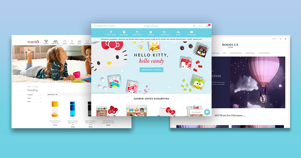
Parenting can be overwhelming, but using the Munchkin website is anything but that. Just the right amount of white space, balanced with vivid splashes of color and easy to read typesetting make navigating throughout the website a breeze. Product pages also come with handy downloadable instructions, which comes in handy in the event you didn’t keep a watchful eye on the instruction manual. You can always refer back to the Munchin website to keep them handy for you. Like their tagline says, it is the little things.
2) Fred Perry

Fred Perry’s website greets you with crisp imagery, subtle interactions and animation along with a clean use of white space to set the tone for their classic sportswear to streetwear brand. A seemingly clean and minimal website, reveals an extensive subculture section that gives an in-depth glimpse into their origin story and the subculture that came to be (both of which Fred Perry carries with pride)– you can dive into interviews and Spotify playlists to immerse yourself in the worlds of the laurel wreath bearers.
3) Sugarfina

The go-to artisan candy company for adults provides a just-as-sweet alternative to stopping by their adorable boutique stores. With beautiful and enticing presentations of their product, you’re sure to be left wide-eyed while you browse. There are options to customize your candy bento box, send a gift for a friend to choose what candy to fill with via their CandyDrop feature. The option to customize their product with your company logo and welcome message for corporate gifting, their online experience roots them as the ultimate candy boutique for grown-ups.
4) Tom Dixon

Modern and simplistic, Tom Dixon’s website decidedly focuses on stylized product imagery to set the tone. With product collection, mini-films featured in their homepage to tell the stories and intent of their designs, their product line is instantly elevated. The sleek styling carries throughout the site, on pages such as category listing pages, with product images styled to almost look as if you’re viewing them in a gallery space.
5) Boodles

With plenty of storytelling, it is evident that although a contemporary and clean website, the Boodles brand carries a long line of British heritage. Coupled with dreamy imagery, you are certainly enticed to click around whether it’s to do some actual browsing or to learn a bit more about the World of Boodles.
6) Bjorn Borg
 Another tennis legend namesake brand on this list, Bjorn Borg (named after the Swedish former tennis player largely considered to be one of the greatest in the history of the sport), honors its roots with signature Swedish sans serif font styles and clean use of space. Bjorn Borg, a brand that honors its past but connected to the present, prominently features UGC on its homepage that puts the spotlight on its audience and their active and urban lifestyles.
7) Shinola (https://www.shinola.com/)

Shinola, the Detroit-based luxury goods brand takes pride in its craft and has a website that wants to be explored. Almost wherever you are on the site, you are given a glimpse of the craftsmanship and the details that characterize their product. Each product is given the premium treatment with thoughtful product descriptions, various product views, and macro shots and promising testimonials. A notable mention being the clever Free Ride to the Top bicycle button at the bottom of their pages.
8) Cobra

With a bold yet very sleek aesthetic, Cobra’s website effectively positions its product in a premium fashion. Their specialty is in golf clubs, and there’s no shortage of tech and performance specs when you dive into their brochure-like (and thoughtfully designed) product detail pages. You will know all the ins and outs of their product as a shopper.
If these examples have got your creative juices flowing and you’d like additional help from Magento Certified experts, please get in touch with us here at DCKAP, we’d love to hear from you!
Contents


